|
www.tlab.it
Textes et Discours comme
Systèmes Dynamiques
N.B .: Cette section est uniquement disponible
en anglais.
This T-LAB tool
provides several integrated analysis
options (see picture below) which can be used in various
combinations for obtaining measures and graphical representations
concerning texts treated as dynamic
systems. In particular this tool allows us to verify how
texts are organized in time, how the recurring themes and the sequential order of utterances relate to each
other and how similarities and
differences between utterances evolve in time. For these
reasons – more than other T-LAB
tools - this tool challenges the divide between qualitative and
quantitative approaches in text analysis.

In principle the objects of this type of integrated
analysis should be texts in which - like discourses and
conversations - the sequence and the temporal flow of utterances is
important (i.e. transcripts of focus group sessions, interviews,
speeches, debates, doctor/patient iterations, novels
etc.).
However, as this tool provides us with similarity measures concerning all pairs of text
segments (both within the whole corpus and within its subsets), it
may be also useful in other cases. Just remember that - when text
segments are not in sequential order - the use of RQA Analysis
and/or Sequence Analysis does not produce proper results.
To begin with, two things must be taken into consideration:
-as the granularity is important, the key-word list chosen before
using this tools should contain as many items as possible;
-at the moment, this tool allows us to analyse a corpus which
includes up to 30,000 text segments (i.e. about 5,000 pages), which
can even be organized in two or more sub-sections (i.e. corpus
subsets). However, due to some limitations concerning the
visualization of recurrence plots, both the RQA Analysis and the
Similarities Measures are available only for corpuses consisting of
up to 3,000 text segments (i.e. about 500 pages, and a bit more
when the corpus has been segmented into paragraphs).
The analysis procedure consists of the
several steps, some of which are automatic and others which - when
desired - can be manually performed by the user.
The initial steps performed
automatically by T-LAB are the
following:
a - construction of a document-term
matrix, where documents are always text segments (i.e. text
fragments, sentences, paragraphs) into which the corpus has been
subdivided (see the T-LAB
initial settings options);
b - topic analysis based on a
probabilistic model which uses the Latent Dirichlet Allocation and
the Gibbs Sampling (see the related information on Wikipedia);
c - use of a Naïve Bayes classifier
for estimating the probability values of each topic within each
text segment, and for assigning each text segment to the topic (or
theme **) it most closely resembles.
(**) 'Topic' and 'Theme' will be hereafter treated as synonymous
terms.
Please note that the main goal of the above automatic steps is to
extract 'k' latent dimensions (where 'k' varies from 20 to 30)
which determine the content structure of the analysed text and
which - like a mixture model - can be used for exploring both text
dynamics and similarities between text segments. For this reason
the segments used for building the model are only those in which at
least two key-terms included in the user list are present.
Differently, after building the model, every text segment - even by
maintaining the mixed nature of its content - is assigned to the
topic to which it most closely resembles.
At the end of automatic steps, five
options are made available, two of which correspond to two
analysis tools already present in the T-LAB menu - namely the Topic Analysis (i.e.
Modelling of Emerging Themes) and the
Sequence Analysis of themes - and which,
for this very reason, do not need further explanations. Just
consult the parts of this help/manual where the main options
depicted in the below section 'F' are commented.
Regarding the new tools, here is - for
each of them - the required information.
A- Real Time
Charts

When plotting real time charts, which allow us to
dynamically visualize the time
sequence of the text segments from the beginning to the end, the
measures used are always the probability values that the Bayes
classifier has assigned – for each of the ‘k’ topics - to each text
segment.
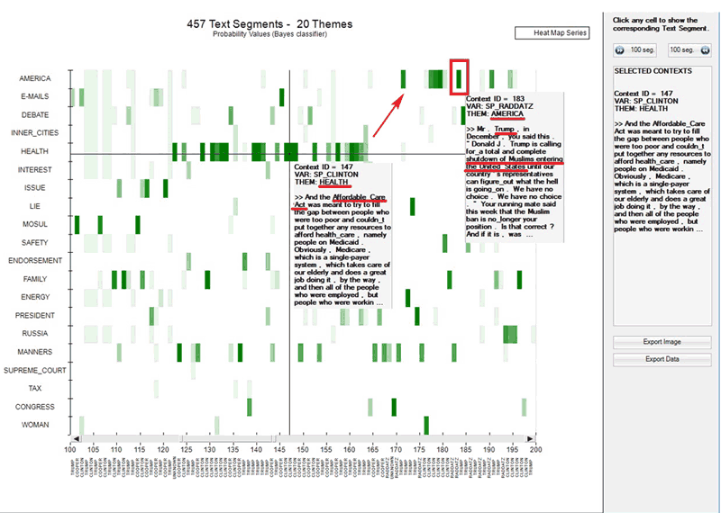
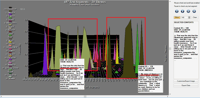
Two complementary charts allows us to easily appreciate
various types of events, including the strong
recurrences of some themes or the shifts from a theme to another (see the below
pictures, obtained by analysing a presidential debate between
Hillary Clinton and Donald Trump which took place on October 2016.
N.B.: In this case the corpus was automatically segmented into
paragraphs and a multi-word list was applied).
Actually, from a semiotic point of view, we may argue that both
these types of charts deal with the relationships between
paradigm and syntagm or – in other words – between the
synchronic and diachronic axes, where paradigm/synchronic refers to
the various themes and syntagm/diachronic refers to the temporal
sequence of the ‘N’ text segments.
As the information summarized by these types of charts mainly
refers to formal aspects of text contents, the same charts may be
regarded as some sort of musical scores where the sequence of
themes and their ‘intensity’ (i.e. probability) vary in time.
Anytime, in order to check ‘who’ is speaking and about ‘what’, just
click the corresponding point.
A.1 - Heat
Map
A.2 -
Waterfall
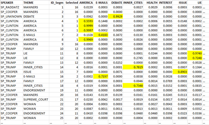
Please note that in the real time charts all text
segments are present, and each of them is represented as a mixture
of probability values associated with the various topics which the
model consists of. In fact, when clicking the ‘Export Data’ option,
all this information is made available in a data table in CSV
format like the following.
B - Preliminary information
about the Recurrence plots

Both the ‘Recurrence Quantification Analysis (RQA)’ and
the ‘Similarity Measures’ tools use the recurrence plot technique. That is to say they
build a N × N matrix, the rows and columns of which – in our case -
are text segments ordered according to their temporal sequence.
However in the two cases the recorded information is different. In
fact, in the first case (i.e. RQA) any recurrence – marked with an unshaded dot - refers
to the presence (absence in the case of white spaces) of the same
theme in the ‘i’ and ‘j’ items (i.e. where the ‘X’ and ‘Y’ values
are the same) and uses a categorical time series as input;
differently, in the second case (i.e. Similarity Measures) any
recurrence – marked with a shaded dot - refers to the similarity
(i.e. Cosine) concerning the ‘i’ and ‘j’ items, the values of which
are continuous (i.e. they vary from 0 to 1 ).
N.B.: In the case of recurrence plots with similarity measures the
cut-off limit used by T-LAB is
0.0001 (Cosine measure). This because many scholars tend to count
all nonzero entries of the similarity matrix.
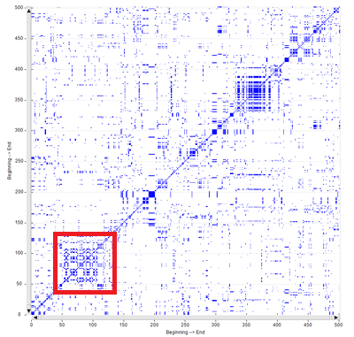
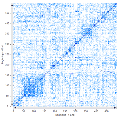
Though the two types of recurrence plots may highlight similar
patterns (see the below Fig. 1 and Fig. 2, which have been obtained
by analysing a legislative text), by default T-LAB uses the first
(i.e. Fig. 1) for computing the RQA measures and it uses the second
(i.e. Fig. 2) for exploring similarities and differences concerning
text segments.
However, by clicking the appropriate button, the user is also
allowed to obtain the RQA measures for the recurrence plots with
the similarity measures. Just remember that, as in this case the
percentage of recurrent points is higher, all RQA measures are
somehow inflated.
The fact remains that, like the 2D barcodes used for marketing
purposes, both the below recurrence plots can be seen as unique
fingerprints of the analysed text.
|
|
|
Fig. 1 - Time Series
|
Fig. 2 - Similarities
|
N.B. The time series used for the recurrence plot
in Fig. 1 is the following:

Both when clicking 'Similarity Measures' and
'Recurrence Quantification Analysis (RQA)' the default
T-LAB chart shows a 100x100
recurrence plot which however can be zoomed
in and out by using the mouse wheel. Moreover in both cases
six different options allow us to
perform different operations (see pictures below).
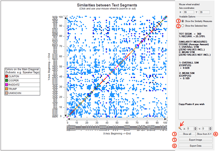
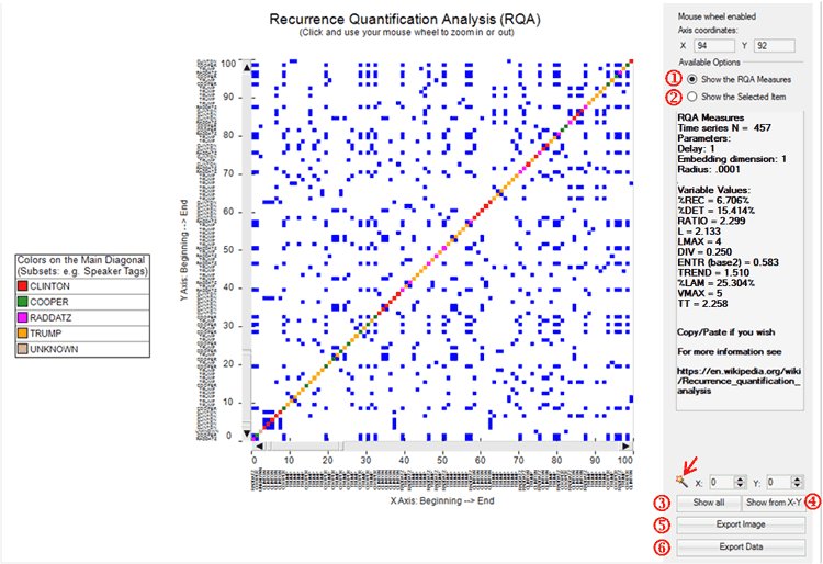
In particular:
-options ‘1’ and ‘2’ allow us to visualize the general measures
(‘1’) or the transcript of the selected segment (‘2’);
-options ‘3’ and ‘4’ allow us to visualize the complete recurrence
plot (‘3’) or a subsection of it (‘4’);
-options ‘5’ and ‘6’ allow us to export the image in different
formats (‘5’) or to export a data table with all the analysed
values (‘6’).
Please note:
-in the RQA case the magic wand button ( ) allows us to
check some characteristics which will be explained in below section
‘D’. Differently, in the case of similarities, the same button may
be used for obtaining the RQA measures for the shown recurrence
plot; ) allows us to
check some characteristics which will be explained in below section
‘D’. Differently, in the case of similarities, the same button may
be used for obtaining the RQA measures for the shown recurrence
plot;
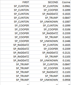
-when exporting the similarity data, all measures concerning
‘Self-Similarity’ and ‘Other-Similarity’ are included (see table
below);
C - Similarity
Measures

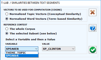
When choosing ‘Similarity Measures’, several options are
made available (see picture below) which allow the user
to select both the vectors to be used for the similarity
computation and the reference context to be analysed (i.e. either
the entire corpus or a subset of it).
N.B.: The difference between ‘conceptual’ (1) and
‘term-based’(2) similarities is that in the first case (1) each
text segment is represented by a feature vector concerning topics,
whereas in the second case (2) each text segment is represented by
a feature vector concerning words. In both cases the similarity
measure used is the Cosine coefficient.
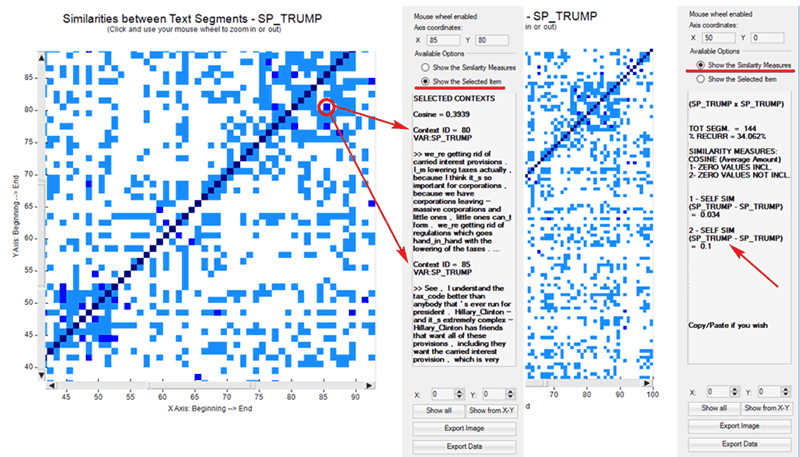
According to the design of the user interface, in
this case - like in the RQA analysis (see section 'D' below) - the
user can choose between visualizing the global measures or the
transcripts of recurrent segments (see picture below). Moreover,
when a corpus subset is selected, two further measures are provided
concerning the 'self-similarity' (i.e. averaged cosine similarity)
between all pairs of text segments within the chosen corpus subset,
one (1) with and the other (2) without zero values included. Other
measures concerning similarities between all pairs of corpus
subsets can be exported by clicking the 'Export Data'
button.
Please remember that, unlike the RQA, the
'Similarity Measures' option considers only those text segments in
which at least two key-terms included in the user list are present.
This is in order to reduce biases in the Cosine computation.
D - Recurrence
Quantification Analysis (RQA)

RQA is a method of nonlinear data analysis for the
investigation of dynamical systems which quantifies the information
contained in a recurrence plot and detects the transitions in the
systems by analysing time series (see https://en.wikipedia.org/wiki/Recurrence_quantification_analysis
).
In this T-LAB tool, both in the case of the RQA Analysis and in the
case of the Sequence Analysis (i.e. Markovian Analysis), a time
series is represented by a categorical vector where each element is
an integer which corresponds to the topic assigned to the 'i' text
segment. However only in the case of the RQA a square matrix is
built where the time series is both in rows and in columns.
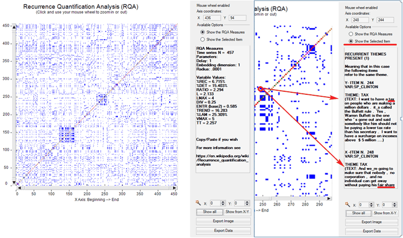
When using the RQA tool, two main options are made always available
(see pictures below):
1-Show the RQA Measures;
2-Show the Selected Item.
In the first case, the standard
measures of RQA are provided (e.g. %REC, %DET, ENTR etc.**).
In the second case the excerpts of recurring text segments are
displayed.
In both cases, the mouse wheel allows zooming in and out. Moreover
two buttons allow the user to export both the picture and the
analysed data.
(**) For more information about the RQA measure see section ‘E’
below.
Please note that in the recurrence plot analysed with RQA
the representation is symmetric across the main diagonal and two
types of lines are particularly important: the diagonals parallel to the main diagonal and the
vertical lines (**). In fact these
lines mark the transitions present in the system and they are the
base for obtaining the various RQA measures.
(**) In any recurrence plot vertical lines and horizontal lines
mirror each other. In fact vertical lines in the upper part of the
plot correspond to horizontal lines in the lower part, and vice
versa.
In particular, the distribution of diagonal lines allows for the
investigation of determinism (i.e.
predictability of the system) and the distribution of vertical
lines allows for the investigation of intermittency (i.e. sequences which are
interspersed by erratic breaks).

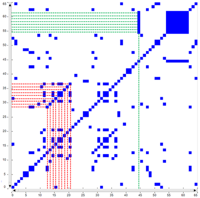
As an example, just consider the above fictitious time
series. In it the same sequence of nine points/themes is repeated
two times in different time spans (see the above red rectangles),
respectively from t-12 to t-20 and from t-28 to t-36, where each
‘t’ stands for a different text segment. In the same series there
is also a sequence – from t-54 to t-61 - in which the same theme
which appears at t-44 is repeated eight times (see the above green
rectangle).
The corresponding recurrence plot (RP) - which has the same time
series on the ‘X’ and the ‘Y’ axes - is that depicted in the image
below.
Please note that in the case of diagonal line each point on the ‘X’
axis (i.e. from t-12 to t-20) recurs with the corresponding point
on the ‘Y’ axis (i.e. from t-28 to t-36); differently the eight
points which form the vertical line recur with just one point (i.e.
t-44).
Accordingly, in musical terms we may say that diagonal lines refer
to a restatement of a motif (i.e. a pattern is repeated), whereas
vertical lines refer to a repetition of a single note which somehow
breaks the thematic variation.
Please note that when a monothematic sequence like that form t-54
to t-61 is repeated two or more times, usually in the recurrence
plot it is represented by a square or by a rectangle.
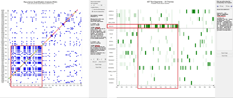
Regarding the rectangular
block structures – which actually include both vertical and
diagonal lines - they can be seen as referring to recurrences of
the same topics in sub sections of the time series, i.e. to groups
of overall similar feature vectors. In fact each dot in the graph
represents a revisit of the same state and there is a
correspondence between the rectangular blocks of the recurrence
plot, the rectangles highlighted in the real time heat map and the
chart of the time series (see pictures below). In other words we
may say that in this cases speakers are repeatedly engaged on the
same topic/theme, which appears to be ‘hot’.

As stated above, in the RQA outputs the longest diagonals parallel to the main diagonal
allow us to detect interesting repetitions of the same thematic
sequence. However their shapes are not so evident as the
rectangular block structures, also because sometimes they can be
hidden inside one of them (see the below case marked with ‘2’). For
this reason T-LAB includes a
specific option (see the magic wand below) which automatically
detects the longest diagonal, informs the user about the sequence
of repeated themes included in it and automatically positions the
cursor in the corresponding X-Y coordinates.
N.B.: Soon after the longest diagonal is detected T-LAB allows the user to export a file with
the most frequent repeated sequences,
each one of them including at least three concatenated themes. Such
a file can be considered a sort of summary of the main themes - and
of the corresponding variations - present in the corpus.
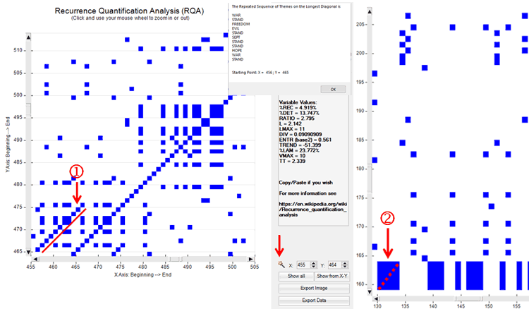
N.B.: In the case of the above diagonal '1', one of the
corresponding patterns on the heat map is the following.

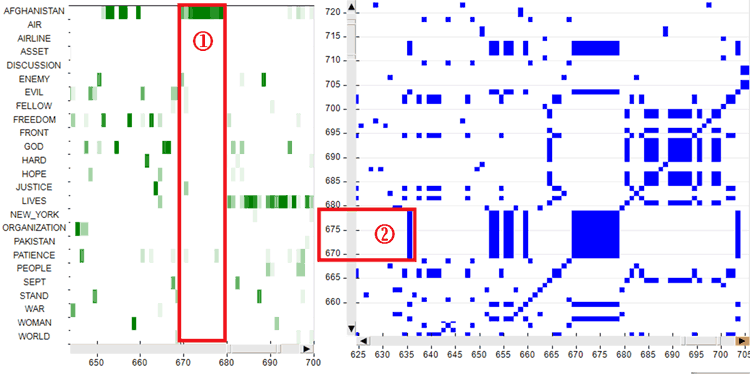
Regarding the vertical/horizontal lines they can be
easily checked by exploring the heat map first (see case '1' in the
image below) and then the recurrence plot (see case '2' in the
image below).
E - Some notes about the RQA
measures
When talking about the RQA measures, we have to make a
clear distinction between their technical definitions (1) and their
relevance in a thematic text analysis (2).
In fact the technical definitions correspond to formulas and are
the same in all sciences using RQA for the study of dynamic systems
and their time series (e.g. physics, physiology, meteorology,
finance, etc.). Differently, the relevance – and also the meaning –
of the RQA measures in text analysis is a matter of debate.
Starting with the technical definitions (1), here is a
table which summarizes the relevant information for the most used
RQA measures.
| Measure
|
Definition
|
| %REC - Recurrence Rate
|
The percentage of recurrence points in a Recurrence
Plot which fall within a specified radius.
|
| %DET - Determinism
|
The percentage of recurrence points which form
diagonal line structures, main diagonal not included (N.B.: In RQA
the main diagonal is also called LOI, i.e. Line of Identity,
because in it each point recurs with itself).
|
| RATIO
|
The ratio between %DET and %REC.
|
| L
|
The average length of the diagonal lines.
|
| LMAX
|
The length of the longest diagonal line.
|
| DIV - Divergence
|
The invrs of MAX
|
| ENTR - Entropy
|
The Shannon entropy of all diagonal line lengths
distributed over integer bins in a histogram (Webber, C. L., &
Zbilut, J. P. , 2005, p. 48). Accordingly, if there are lots of
diagonal lines with varying lengths, the entropy will be high.
Please note that, as in the RQA case entropy reflects the
complexity of the RP in respect of the diagonal lines, here the
definition of entropy does not correspond to the entropy of
physical systems, where the higher the entropy the greater the
disorder.
|
| TREND
|
The degree of system stationarity . Accordingly,
when recurrent points are homogeneously distributed across the
recurrence plot, TREND value will be close to zero. Differently,
when points 'fade away' from the central diagonal, the trend will
have a negative value.
|
| %LAM -
Laminarity
|
The
percentage of recurrence points which form vertical lines.
|
| VMAX
|
The length
of the longest vertical line.
|
| TT - Trapping time
|
The average length of the vertical lines.
|
Regarding the relevance of RQA measures in text analysis
(2) both %DET and TREND deserve special attention. In fact higher
determinism (%DET) values indicates that the same thematic patterns
are repeated more often and that – accordingly – the dynamic of
analysed system is somehow more predictable. On the other hand
TREND can be interpreted as a measure referring to how quick the
transitions are from some themes to others, where lower TREND
values indicate quicker transitions.
For example, when comparing RQA measures obtained by analysing a
scientific essay (‘a’) and a novel (‘b’), we can find out that in
the first case (‘a’) the %DET value is higher than ‘b’ and that in
the second case (‘b’) the TREND value is very low (often below
zero).
Below is a comparison of the RQA measures obtained by analysing the
essay ‘On the Origin of Species’ (C. Darwin) and the novel ‘The
adventures of Pinocchio’ (C. Collodi).
| On the Origin of Species (a) |
The adventures of Pinocchio
(b) |
%REC = 8.201%
%DET = 16.474%
RATIO = 2.009
L = 2.093
LMAX = 6
DIV = 0.167
ENTR (base2) = 0.460
TREND = 4.705
%LAM = 30.717%
VMAX = 7
TT = 2.263
|
REC = 3.525%
%DET = 9.676%
RATIO = 2.745
L = 2.089
LMAX = 5
DIV = 0.2
ENTR (base2) = 0.435
TREND = -5.599
%LAM = 23.194%
VMAX = 6
TT = 2.267
|
Here are the two corresponding recurrence plots.
|
On the Origin of Species
(a)
|
The adventures of Pinocchio
(b)
|
|
|
|
N.B.: A table which summarizes the meanings of typical
patterns in recurrence plots can be found at page 251 of the
following article:
N. Marwan, M. Romano, M. Thiel and J. Kurths, “Recurrence Plots for
the Analysis of Complex Systems", Phys. Rep. 438, 240-329
(2007).
F - Topic Analysis and
Sequence Analysis
The below pictures summarize the main options of two
tools already present in the T-LAB menu, which are integrated with the new
ones and which are explained in the corresponding sections of this
manual/help, i.e. Modeling of Emerging
Themes and Sequence and Network
Analysis.
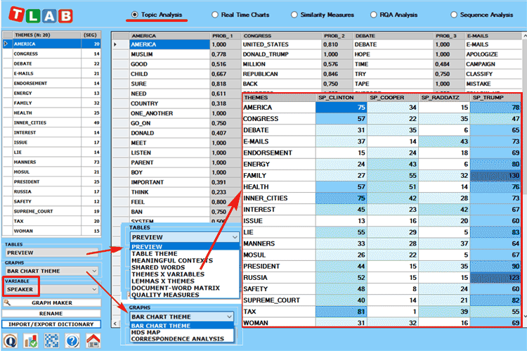
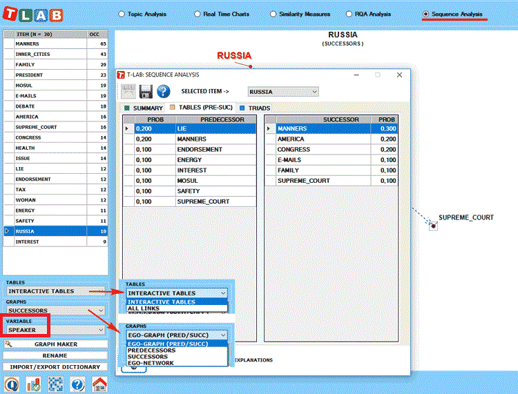
N.B.:
-Any variable selected in the above forms (see the label
highlighted by a red rectangle) will be used in the outputs
provided by the various tools (Please note that only categorical
variables with up to 20 values are made available) ;
-The ‘Export/Import Dictionary’ option, which is no longer
available after performing a Sequence Analysis, is intended to
allow the user to save time when repeating the same analysis by
using topic labels manually assigned previously. In other words:
just export the topic dictionary after completing - if desidered -
all renaming operations and import the same dictionary when
repeating the same analysis with the same corpus, the same key-word
list and the same parameters;
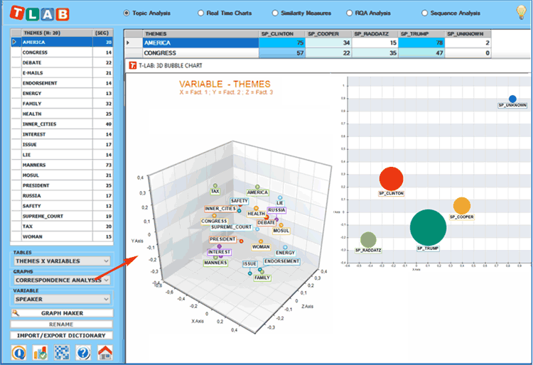
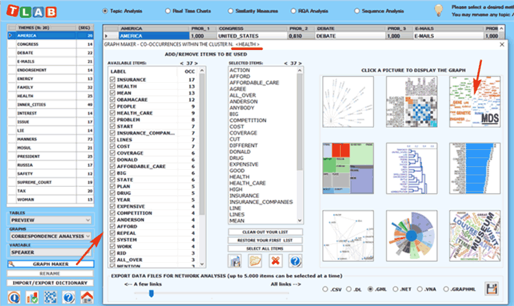
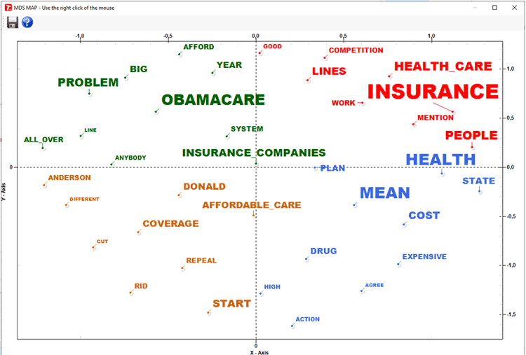
-While the
Correspondence Analysis option allows us to explore the
relationships between the various topics and the various speakers,
the 'Graph Maker' tool allows us to explore the relationships
between key-terms within each selected topic (see pictures
below).
|